
Finding the perfect neutral paint color can feel overwhelming. Between cool grays, warm beiges, and everything in between, it’s easy to get lost in endless swatches. That’s why Sherwin Williams Accessible Beige (SW 7036) has become such a trusted choice for homeowners and designers. It strikes a delicate balance between warm and cool, offering a soft, inviting look that adapts beautifully to different spaces and lighting conditions.
What makes Accessible Beige a standout shade?
Accessible Beige stands out because it manages to look both modern and classic at the same time. While gray paint colors dominated the last decade, many people now want a softer option that doesn’t feel cold. Accessible Beige fills that gap by blending beige with subtle gray undertones. It doesn’t come across as too yellow, too stark, or too muddy — instead, it feels balanced, calm, and versatile.
For people who want a neutral backdrop without committing to the extremes of white or gray, Accessible Beige provides exactly that. It creates a foundation that works in both traditional and contemporary homes, making it a safe yet stylish investment.
Why homeowners and designers continue to choose it?
Designers often praise Accessible Beige because of its adaptability. It works equally well with warm wood tones, crisp white trim, or bold accent walls. Homeowners love it because it doesn’t box them into one style. Whether you want to decorate with earthy textures, coastal blues, or modern blacks and grays, this shade blends effortlessly.
It’s also considered a “lifestyle” neutral. In other words, Accessible Beige feels welcoming without drawing too much attention to itself. That quality makes it an excellent choice for open floor plans where rooms flow into each other and need a cohesive color story.
The True Nature of Accessible Beige
To truly understand why this paint color works so well, it helps to look closer at its makeup. Paint shades aren’t just about appearance — they’re defined by undertones and measurable values that affect how they perform in real life.
Undertones and how they shift in different settings
Accessible Beige has a soft beige base mixed with a hint of gray. This undertone prevents it from looking too warm or yellow. Depending on the light, the gray can show up more strongly, giving the color a greige quality.
In bright natural light, the beige side becomes more visible, warming up a space. In darker or cooler light, the gray undertones become more pronounced, creating a slightly moodier effect. This chameleon-like quality is part of why the color feels so flexible.
LRV (Light Reflectance Value) and what it means for your space
Light Reflectance Value, or LRV, measures how much light a color reflects. Pure white is close to 100, while pure black is close to 0. Accessible Beige sits at 58, placing it slightly above the middle of the scale.
That means it reflects a good amount of light without being overly bright. It’s light enough to feel fresh and airy but deep enough to provide contrast against trim or lighter accents. For homeowners, this makes Accessible Beige easy to live with: it won’t feel stark during the day or too heavy in the evening.
Accessible Beige in Natural and Artificial Light
One of the most important things to remember about any paint color is that it doesn’t look the same everywhere. Lighting plays a huge role in how Accessible Beige shows up on your walls.
How the color reacts in north vs. south-facing rooms?
In north-facing rooms, which typically get cooler, bluer light, Accessible Beige leans more toward its gray side. It may feel slightly cooler and more subdued, making it a good option if you want to tone down a bright space.
In south-facing rooms, which receive warmer golden light, the beige undertones stand out. The color feels warmer, cozier, and more inviting. This adaptability is one reason designers often recommend testing paint swatches in multiple rooms before making a final decision.
Daytime versus evening appearances
During the day, natural sunlight allows Accessible Beige to look soft and balanced. At night, under artificial light, it can shift depending on the bulb type. Warm incandescent bulbs emphasize the beige tones, while cooler LED lighting may bring out more of the gray.
This versatility means you’ll want to test it at different times of the day in your own space. Doing so ensures you’re happy with how the color looks during breakfast, in the middle of the afternoon, and when you wind down in the evening.
Pairing Accessible Beige with Other Colors
A great paint color doesn’t just stand alone — it works best when paired thoughtfully with other shades. Accessible Beige offers plenty of flexibility in this area.
Coordinating with whites and neutrals
For a fresh, timeless look, pair Accessible Beige with clean white trim. Colors like Sherwin Williams Pure White or Alabaster complement it beautifully, creating crisp edges that highlight the warmth of the beige.
It also works well alongside other soft neutrals, such as greiges or warm taupes. This layering effect gives a space depth without overwhelming it. Designers often use Accessible Beige on the walls and choose slightly lighter or darker shades from the same family for adjacent rooms, creating a seamless flow.
Balancing with bold accent shades
Accessible Beige shines as a backdrop for bolder colors. Deep navy, forest green, or even charcoal black look striking against its softness. If you want to make a statement, consider pairing it with jewel tones in fabrics or artwork.
Because the paint itself is understated, it allows accent colors to stand out without competing. This is particularly useful in open spaces where bold choices need a neutral anchor.
Where to Use Accessible Beige in Your Home?
One reason Accessible Beige has gained so much popularity is its versatility across different areas of the home. It isn’t limited to just walls; it adapts well in multiple applications.
Walls and trim applications
Painting walls in Accessible Beige gives a room an immediate sense of warmth and sophistication. For trim, using the same shade in a semi-gloss finish creates a subtle, monochromatic look. Alternatively, pairing it with white trim offers contrast and definition.
Kitchens, bathrooms, and living spaces
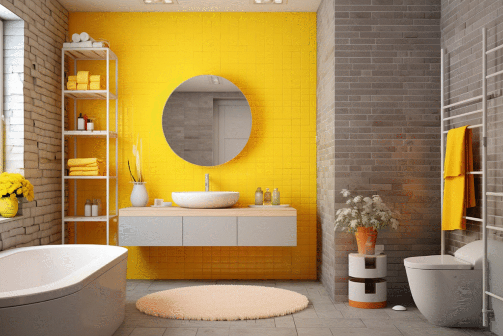
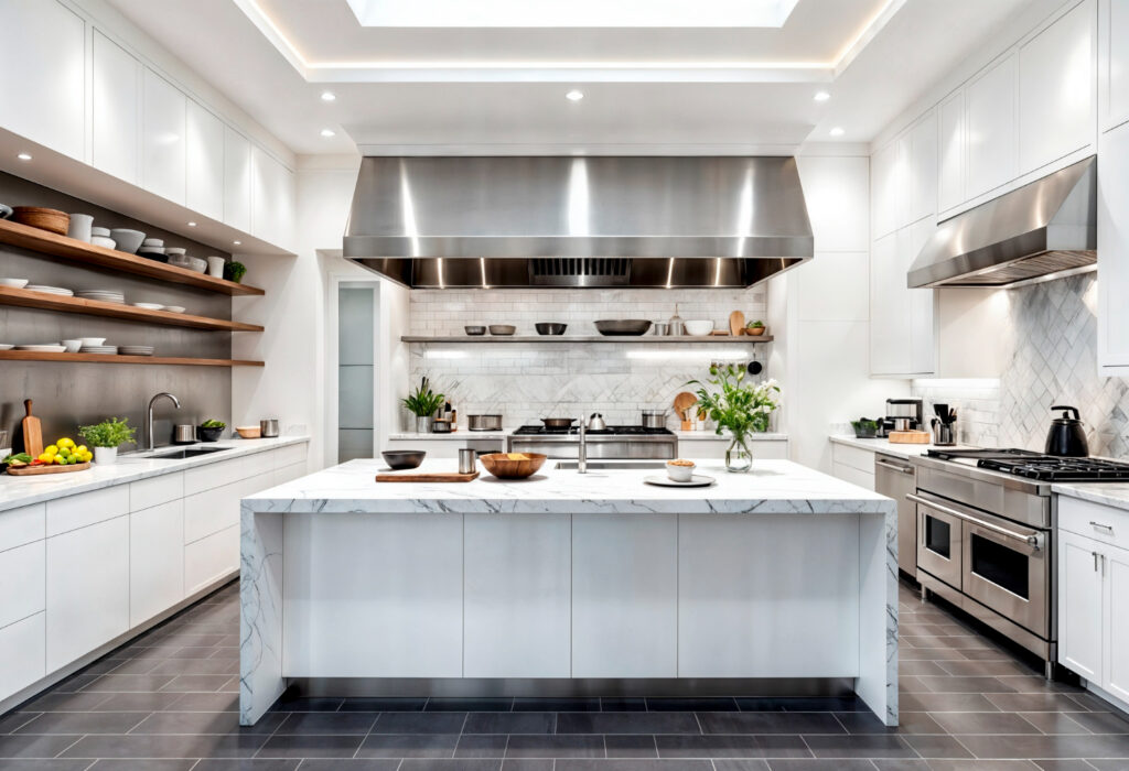
In kitchens, Accessible Beige looks particularly beautiful against warm wood floors, white cabinetry, or natural stone countertops. In bathrooms, it brings a spa-like calm when combined with crisp tiles and soft linens.
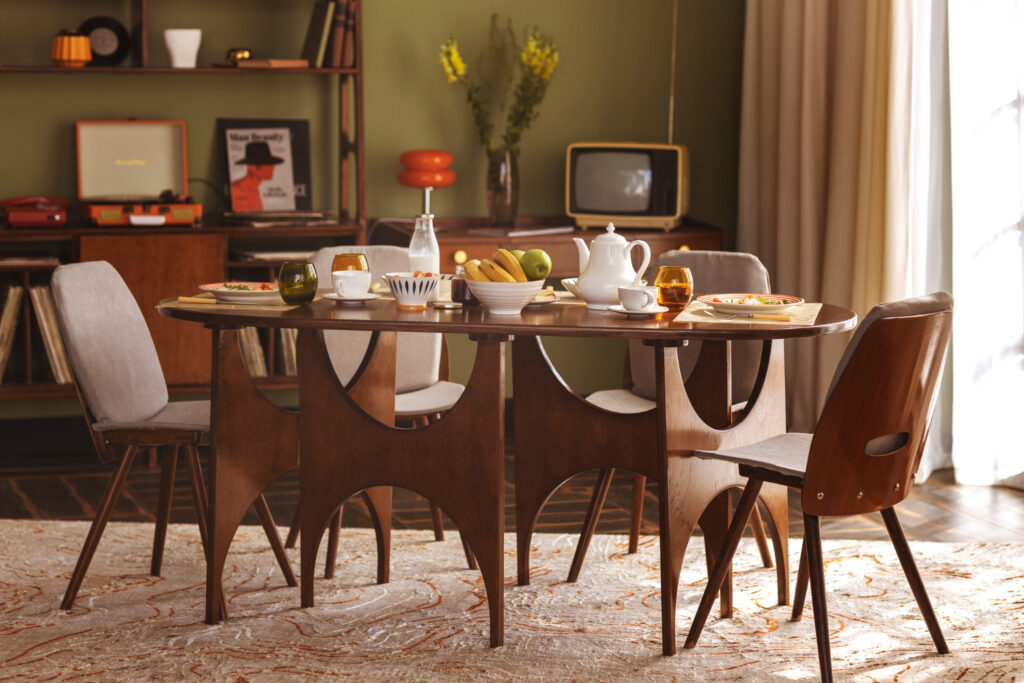
Living rooms painted in Accessible Beige tend to feel inviting yet neutral enough to handle frequent décor changes. It’s a safe choice if you enjoy redecorating often, as the color adapts to seasonal updates.
Cabinetry and furniture updates
Beyond walls, Accessible Beige can also work on cabinetry or even furniture pieces. Painted cabinets in this shade add a subtle, timeless elegance that doesn’t overpower the rest of the room. For furniture, a dresser or bookshelf painted in Accessible Beige blends seamlessly into a space while adding a touch of customization.
Accessible Beige Compared to Similar Shades
Neutrals often look very similar on a swatch card, but subtle differences matter once the paint is on the wall. Comparing Accessible Beige to other popular shades highlights its unique qualities.
How it stacks up against popular greiges?
Colors like Revere Pewter by Benjamin Moore or Agreeable Gray by Sherwin Williams often get compared to Accessible Beige. While they share similarities, there are differences worth noting.
Revere Pewter leans cooler and slightly darker, which can feel more gray in certain spaces. Agreeable Gray sits closer to a true greige, often reading cooler than Accessible Beige. By comparison, Accessible Beige remains softer and warmer without tipping into yellow or brown.
Subtle differences that affect design choices
These small shifts matter when coordinating with flooring, furniture, or countertops. For instance, if you have warm hardwood floors, Accessible Beige harmonizes more naturally than cooler greiges. If your décor leans modern and you want sharper contrast, a cooler shade might suit better.
By testing samples side by side, you’ll notice how these subtleties influence the overall feel of a room.
Why Accessible Beige Remains a Classic?
Even as design trends evolve, some paint colors remain relevant because they strike a perfect balance. Accessible Beige is one of those shades.
Its adaptability across design styles
Whether your home leans farmhouse, transitional, traditional, or modern, Accessible Beige fits right in. Its neutrality allows it to blend with rustic wood beams, sleek furniture, or coastal textiles.
This adaptability makes it an excellent choice for homeowners who may want to change their style over time without repainting their entire home.
The enduring appeal of soft neutrals
Soft neutrals create spaces that feel calm, welcoming, and timeless. They don’t overwhelm the eye or limit decorating options. Accessible Beige embodies these qualities, which is why it continues to be one of Sherwin Williams’ most recommended shades.
Conclusion
Choosing the right paint color is about more than just aesthetics — it’s about creating an environment that feels like home. Accessible Beige (SW 7036) delivers on that promise by offering warmth, balance, and versatility. It adapts beautifully to light, coordinates with a wide range of colors, and suits nearly every design style.
While Accessible Beige works in many situations, the best way to know if it’s right for you is to test it in your space. Light, furnishings, and finishes all influence how it appears. By trying samples on your walls and observing them throughout the day, you’ll gain the confidence to move forward with a shade that feels timeless and uniquely yours.