When people talk about neutrals in design, the first colours that often come to mind are white, beige, or gray. But there is another quiet star that has taken centre stage in modern interiors: taupe. This versatile shade has become one of the most popular choices in homes, hotels, and even public spaces. It offers a subtle warmth, yet still feels contemporary and fresh.
Taupe matters because it bridges the gap between cool and warm tones, making it one of the most adaptable colours for walls, flooring, and décor. Whether you’re planning a sophisticated living room or a calming bedroom retreat, taupe can set the mood while giving you the flexibility to add personality through accents.
In today’s design trends, taupe is more than just a safe choice. It has become a symbol of understated elegance and timeless appeal. Understanding its roots, uses, and challenges can help you work with this colour in a way that feels modern and intentional.
Defining Taupe as a Colour
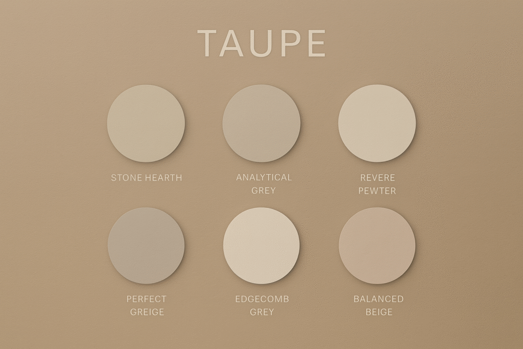
The word taupe comes from the French word for mole, taupe, which describes the soft brownish-gray colour of the animal’s fur. Over time, the term evolved to cover a wide spectrum of shades sitting between gray and beige.
Taupe is neither fully warm nor completely cool. It is best understood as a neutral hybrid, which is why it adapts so easily to different palettes. The undertones of taupe can lean violet, pink, or sometimes even green, depending on the specific shade. This subtle undertone difference is what makes taupe both versatile and tricky.
On the colour wheel, taupe positions itself between beige’s warmth and gray’s cool sophistication. This balance gives taupe its understated charm. It is softer than charcoal gray and more grounded than cream beige, offering designers a middle ground that feels natural and lived-in.
The Versatility of Taupe in Design
Taupe’s popularity comes from its ability to act as a neutral foundation. It sets the stage for bold colours, textured finishes, or layered patterns without overwhelming a space. A taupe wall, for example, can instantly make bright artwork or deep wood furniture stand out.
From classic interiors to modern minimalist homes, taupe has found its place. In traditional settings, it pairs beautifully with rich woods and soft fabrics. In contemporary spaces, it works as a backdrop for metal accents, clean lines, and glass. Its flexibility is what makes it a go-to colour for homeowners and designers who want something stylish yet safe.
Taupe in Interior Spaces
One of the most common uses of taupe is on walls. It provides a calm backdrop for living rooms, bedrooms, and even kitchens. Unlike pure gray, taupe doesn’t feel cold, and unlike beige, it doesn’t feel outdated. This balance makes it a frequent recommendation for people looking to refresh their homes without taking big risks.
Flooring is another area where taupe dominates. Many wood-look tiles, laminates, and carpets lean toward taupe undertones. These choices give spaces a modern feel while maintaining a natural warmth.
In furniture, taupe is especially popular in sofas, chairs, and headboards. Upholstery in taupe tones offers durability in style, since it blends with multiple palettes and adapts to changing décor trends.
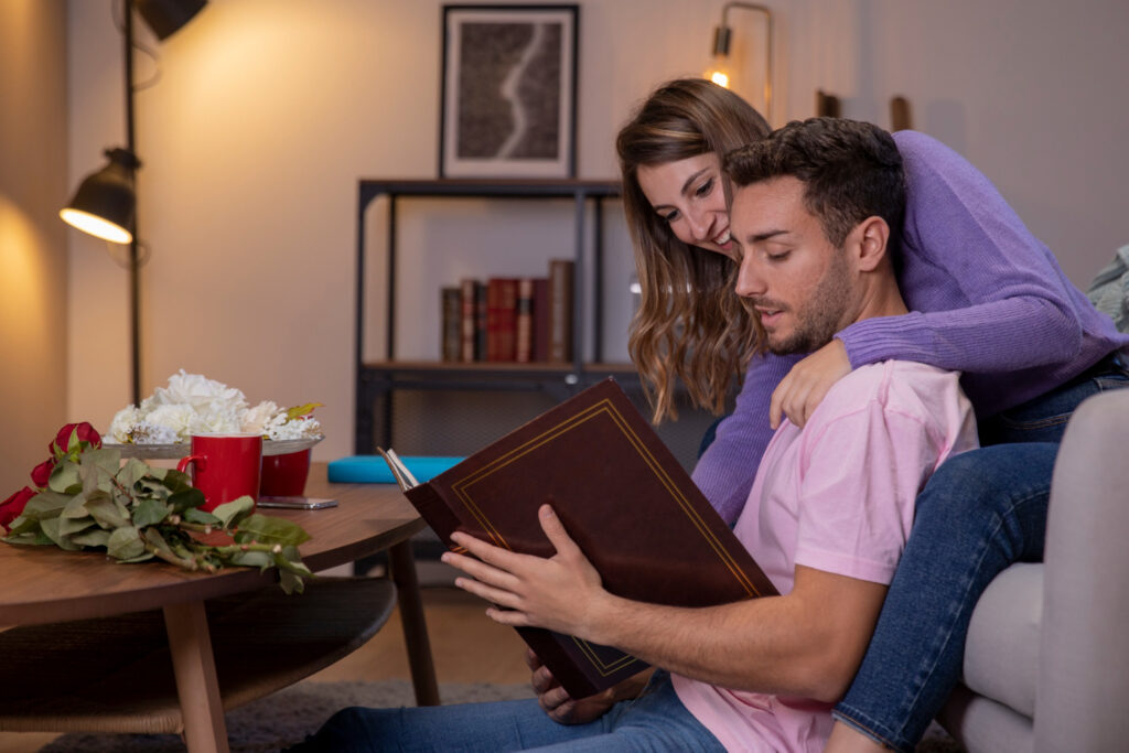
Perhaps taupe’s greatest strength in interiors is the mood it creates. It delivers a sense of grounded calmness, perfect for bedrooms and spa-like bathrooms, but it can also bring sophistication to dining areas and open living spaces.
Pairing Taupe with Other Colours
Pairing taupe effectively depends on its undertone. A taupe with pink or violet undertones often looks best alongside blues and soft greens. Meanwhile, a taupe with subtle green undertones may pair more easily with yellows, creams, and earthy reds.
Complementary colours include crisp whites, navy blues, soft blush pinks, and muted sage greens. These pairings allow taupe to feel fresh rather than dull. Metallic finishes such as bronze, aged brass, and pewter also highlight taupe’s richness.
The undertone factor is key: pairing taupe with clashing undertones (like mixing pink-based taupe with strong green accents) can make it appear muddy or mismatched. Large paint samples and test swatches are essential before finalizing colour combinations.
Taupe in Current Trends
Taupe has grown in visibility over the past decade because of the gray movement in design. As gray walls and flooring became popular, many people sought a warmer option without returning to beige. Taupe filled this gap perfectly.
Weathered woods, reclaimed finishes, and concrete-inspired tiles often lean taupe, reinforcing its place in modern interiors. Brands such as Sherwin-Williams and Benjamin Moore frequently feature taupe shades in their collections, naming them among the most approachable neutrals for homeowners.
At the same time, taupe aligns with the desire for softer minimalism. While stark white minimalism can feel cold, taupe brings depth and warmth without losing simplicity. This is why taupe continues to dominate décor catalogues, flooring choices, and even textiles.
Advantages and Limitations of Taupe
The advantages of taupe are clear:
It is versatile, stylish, and timeless. It adapts to multiple design aesthetics and rarely feels out of place. For homeowners who want a safe colour choice, taupe is almost always recommended.
However, there are limitations. Taupe’s undertones can restrict your future design choices. If your flooring or kitchen cabinetry is fixed in a taupe shade, your options for accent colours may be narrower compared to more flexible neutrals like greige or soft gray.
Another limitation is the risk of looking flat or dated if overused. Entire rooms filled with taupe finishes can lack contrast, making the space appear dull. Without enough white, light, or contrasting accents, taupe can quickly lose its charm.
How to Make Taupe Feel Fresh and Modern?
The secret to making taupe work lies in balance. Taupe thrives when paired with creamy whites that lift its earthy undertones. This contrast prevents the colour from feeling heavy.
Textures also play a big role. Layering taupe with linen fabrics, natural woods, or metallic accents creates depth and sophistication. In modern spaces, taupe pairs beautifully with marble, concrete, and glass.
Light is essential. Taupe can shift in appearance depending on natural and artificial lighting. Brighter spaces tend to highlight its warmth, while dim settings can make it appear darker and more muted. Designers often recommend testing taupe under different lighting before committing to it.
By combining taupe with bolder accents—navy, blush, teal, or even mustard—you can transform it from a safe neutral into a stylish statement.
Conclusion
Taupe is more than just another neutral—it is a colour that balances warmth and coolness, tradition and modernity. Its timeless quality makes it a strong choice for interiors, but its undertones require thoughtful planning.
When used wisely, taupe can anchor a room, highlight textures, and provide the perfect backdrop for colourful accents. It continues to stand strong in today’s design trends, offering homeowners and designers a flexible option that rarely goes out of style.
For anyone considering taupe, the advice is simple: embrace its warmth, test its undertones, and balance it with contrast. Done right, taupe can bring harmony, sophistication, and timeless elegance to any space.